Technologies We Work With


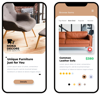
Responsive web design adapts a website's layout and content to different screen sizes for an optimal experience
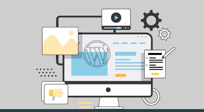
In today’s digital world, a responsive website is essential to ensure your business stays ahead of the competition. At V Pioneer Group, we specialize in responsive website design and development that ensures your site looks great and performs seamlessly across all devices, whether it’s a desktop, tablet, or mobile phone. Our team of expert designers and developers creates visually stunning, user-friendly websites that adapt to different screen sizes and resolutions, providing an optimal browsing experience for your visitors.
We design websites with a mobile-first strategy to ensure the best user experience on all devices.
Tailored designs that reflect your brand’s identity and resonate with your target audience.
Websites designed to be search-engine friendly, improving your chances of ranking higher in search results.
Intuitive navigation and interactive features that keep visitors engaged and encourage conversions.
Ensuring your site works smoothly across all browsers, including Chrome, Firefox, Safari, and more.
Fast-loading websites for better user experience and improved SEO rankings.

Whether you’re looking to update your existing website or create a brand-new one, V Pioneer Group is here to help you design a responsive, scalable, and future-proof website that meets the needs of your business and your customers. Get in touch with us today to start building a website that drives results and delivers an exceptional user experience.